Create Sandbox for Magic Leap
About
Flagship 1st party product for Magic Leap that launched on first editions of hardware worldwide, with a goal of pushing the boundaries of spatial interfaces and developing heuristics, interface components + interaction frameworks for devs/creators.
Role
Lead Visual UI/UX Designer: Lead the visual design of Create’s UI, defined guiding principles, OS interactions, and 3D interfaces.
Awards
Auggie Award Winner 2019 - Best Game
Patent number: D0879811 - Display panel or portion thereof with a transitional mixed reality graphical user interface
Patent number: D892133 - Display panel or portion thereof with graphical user interface
Guiding Principles
- Intuitive: Create is a broadly accessible experience. Intuitive interactions and recognizable content allow you to venture into spatial computing in your own space, on your own terms.
- Explorative: Learn how Magic Leap One works through Create, and explore spatial computing in a way that can't help but make you smile.
- Educational: Create provides a clear look at how a multitude of features work on Magic Leap One, from character AI to UI interactions, room meshing to 6DoF controls.
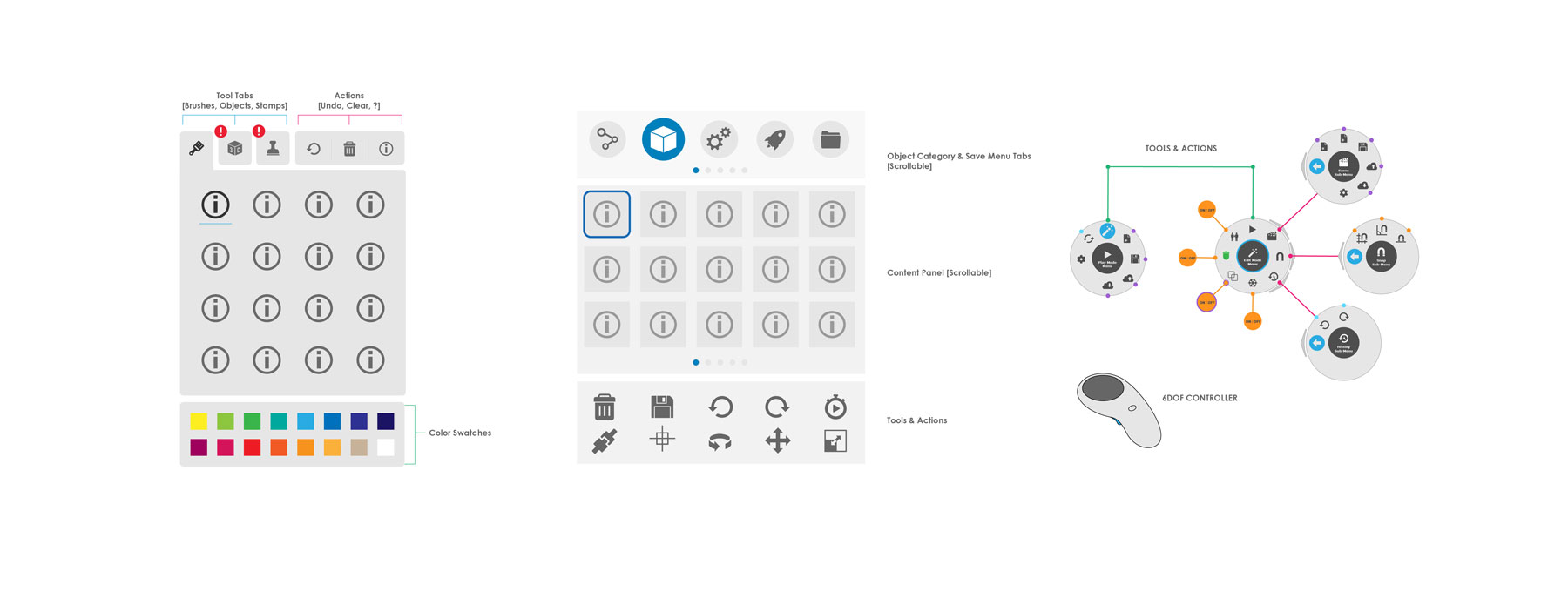
2D GUI Iteration
Initial explorations using 2D UI paradigms. We quickly decided as a team that we wanted to take advantage of the 3D nature of our developing platform and push the limits of our visual and interaction design. The focus of the iterations to follow 2D:
- Spatial UI (skeuomorphic design)
- Form following function (industrial design inspired)
- Account for various object types (consider scalability)
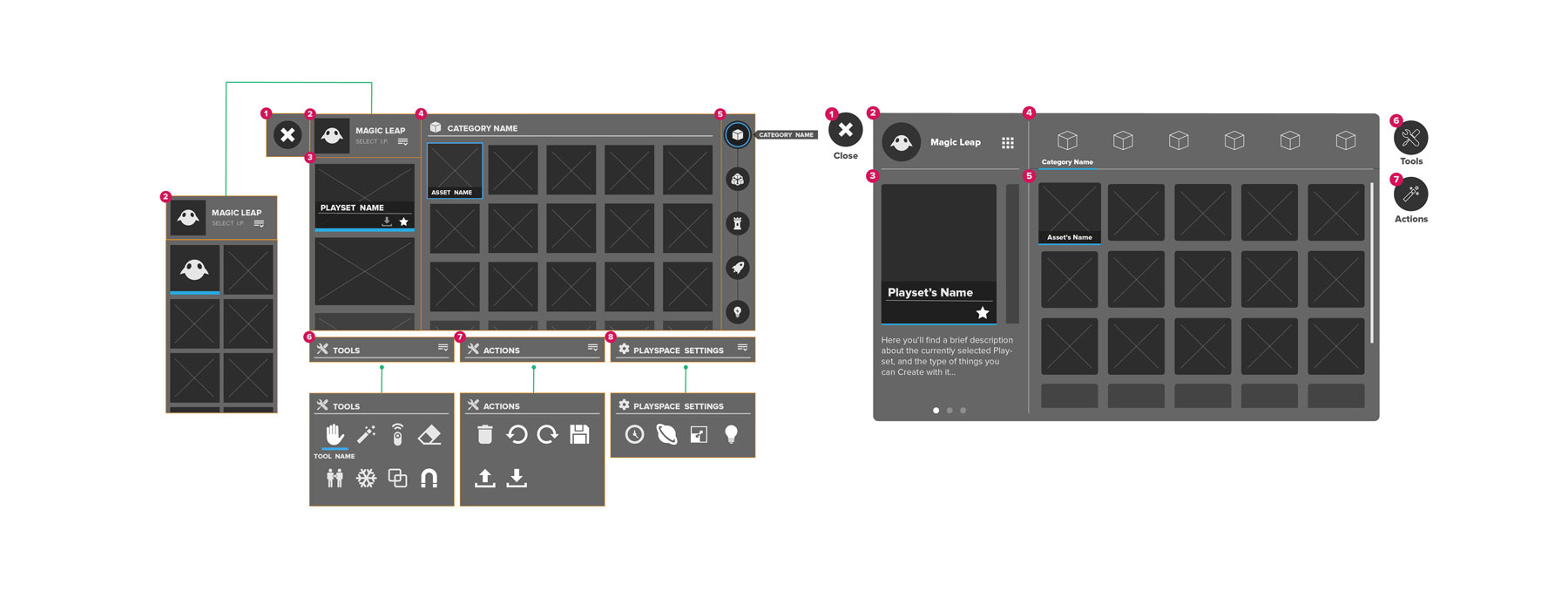
3D GUI Iteration
We wanted to present objects in an interesting way, provoking curiosity through an invitation for users not only to grab objects but to appreciate their details before setting them loose in their space. Through user testing and system constraints, particularly a clipping plane being enforced, we decided as a team to move away from this direction.
Challenges:
Constantly evolving hardware/software changing requirements
Clipping plane implementation, leading to UX difficulties when viewing items within arms reach
Moving away from intuitive interaction because of hardware constraints
Browsing when platform scales to dozens of items
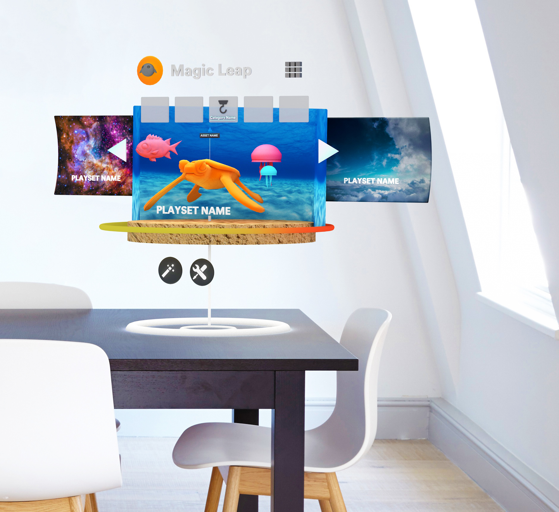
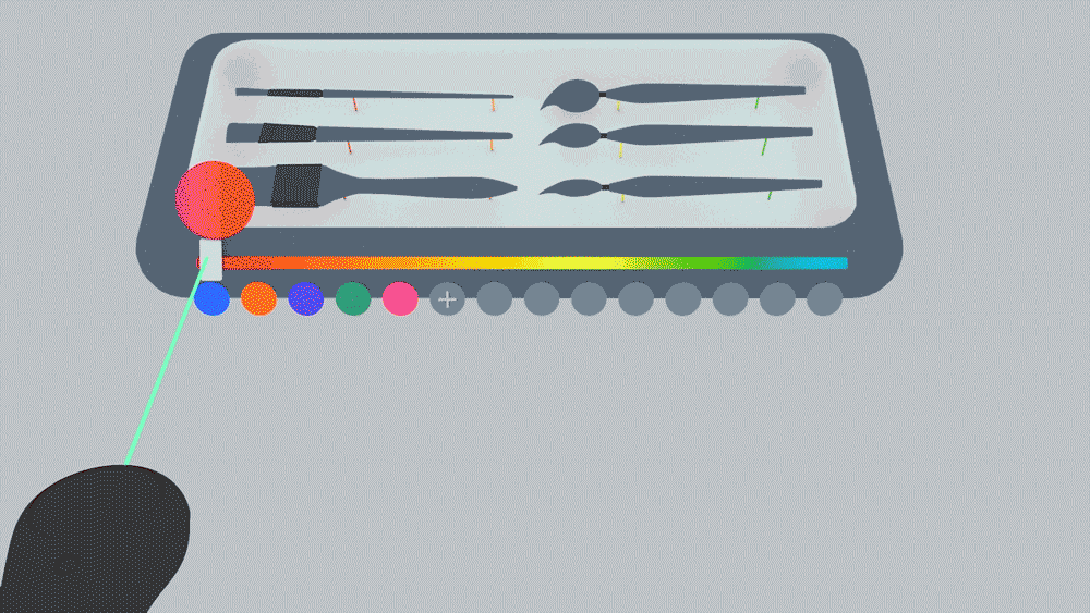
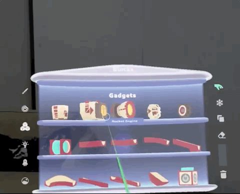
Create 1.0
This was the final GUI for the first release of Create. Thorough user testing informed the scale, body-centric placement, final form, iconography, and interaction.
Ultimately the team landed on the idea of shelves contained inside a frame, where form followed function. We validated this concept through playtesting to ensure the design met the user's mental model for how the interaction should work. This metaphor let us pose all the objects as if they were part of a collectible display shelf which users could simply scroll through to quickly access. It also elevated the perception of the game objects visually by displaying them as trophies.
Highlights:
- Patented System
- Visual feedback & shader support on object states
- Reduced user errors with reinforcing interactions
- Hover states + animation
- Gauge system indicating “cost” of each object to keep framerate high
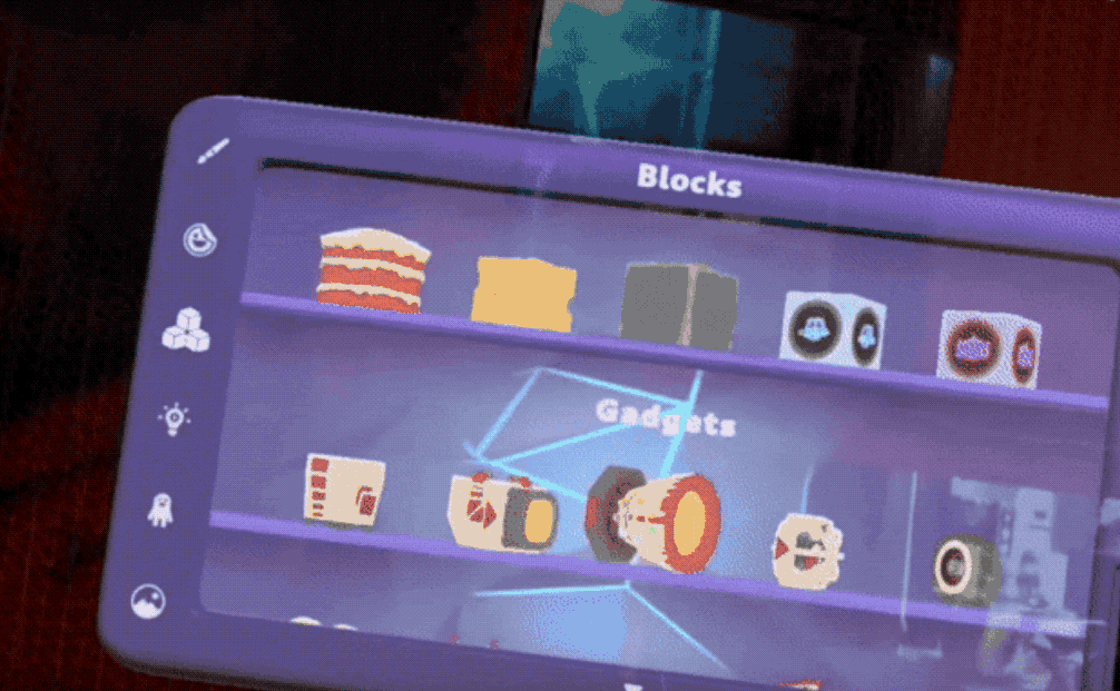
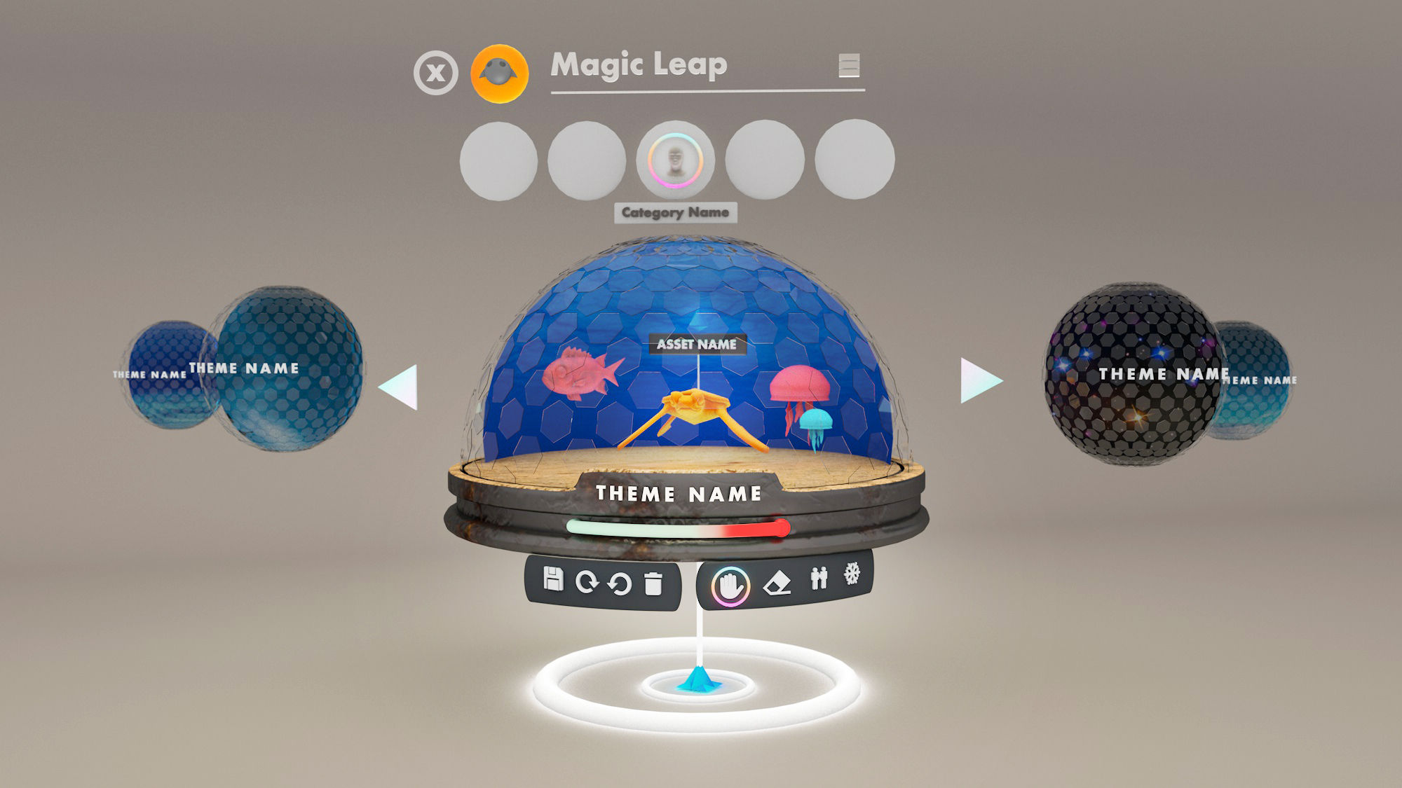
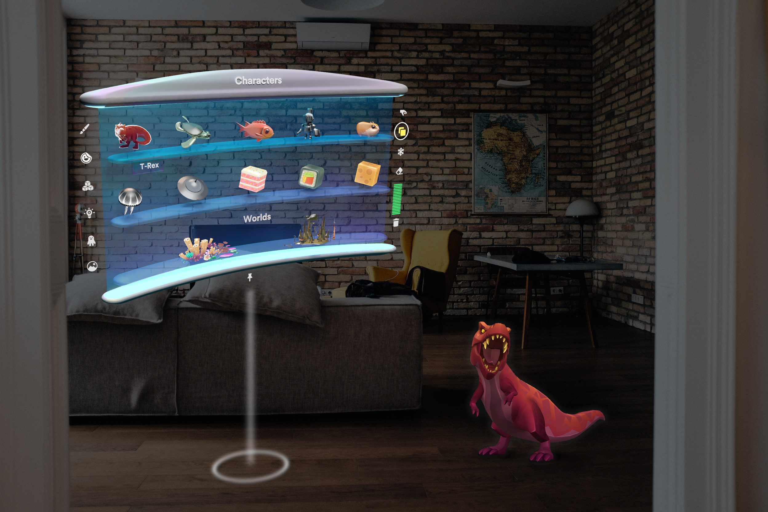
Create 2.0
The latest version of the Create GUI took a more minimal approach based on user feedback. I simplified the form and recreated a portal metaphor for the scrolling action. The background used a transparent shader as to not obscure the real world behind the menu.
Highlights:
- “Spatial Locator” that indicates object placement in regards to world space, user position and other digital objects
- Minimal UI, focusing the experience on content in the scene
- Affordances for grabbing and menu translation/rotation
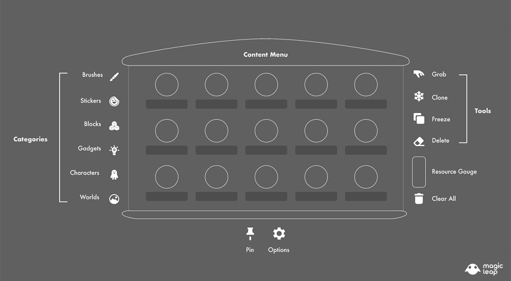
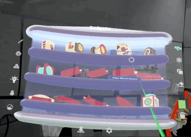
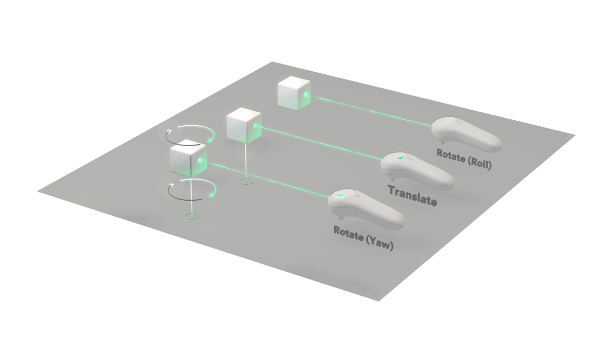
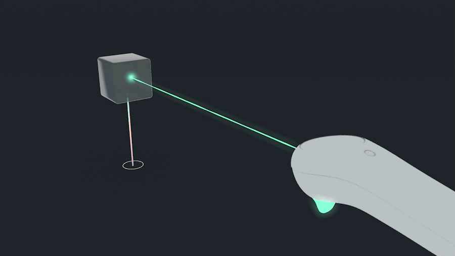
Inputs, Interactions & Affordances
The controller was the main input for Create because it required the least amount of physical effort from the user and offered a wide range of features that we could leverage to amplify our interactions. In addition to inputs we implemented in-world/in-game affordances to allow for novel interactions with a users surroundings.
Explorations:
- Gaze Control: Limited range of motion and strenuous in the long term
- Gesture Control: Novel, but extremely physically demanding and lacking haptic feedback
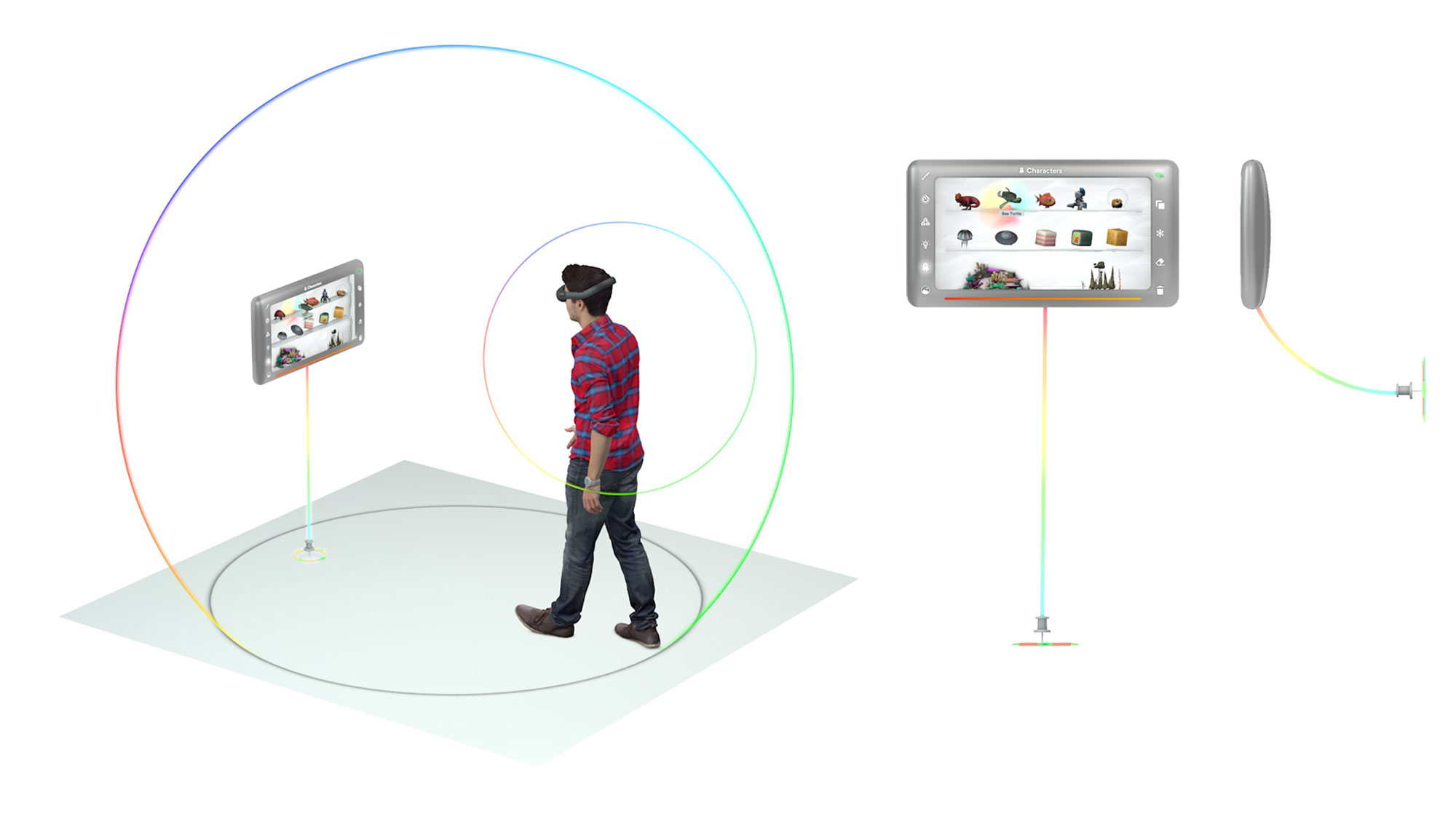
The menu is tethered to the user with an invisible leash following body-centric constraints. This allows the menu to always be nearby for easy and quick content extraction.
Details:
“Pinning” affordance for walls and planar surfaces when ancoring the menu in the real world
Rules around how the menu would follow the user
Max/min limits to account for our clipping plane and focal lengths
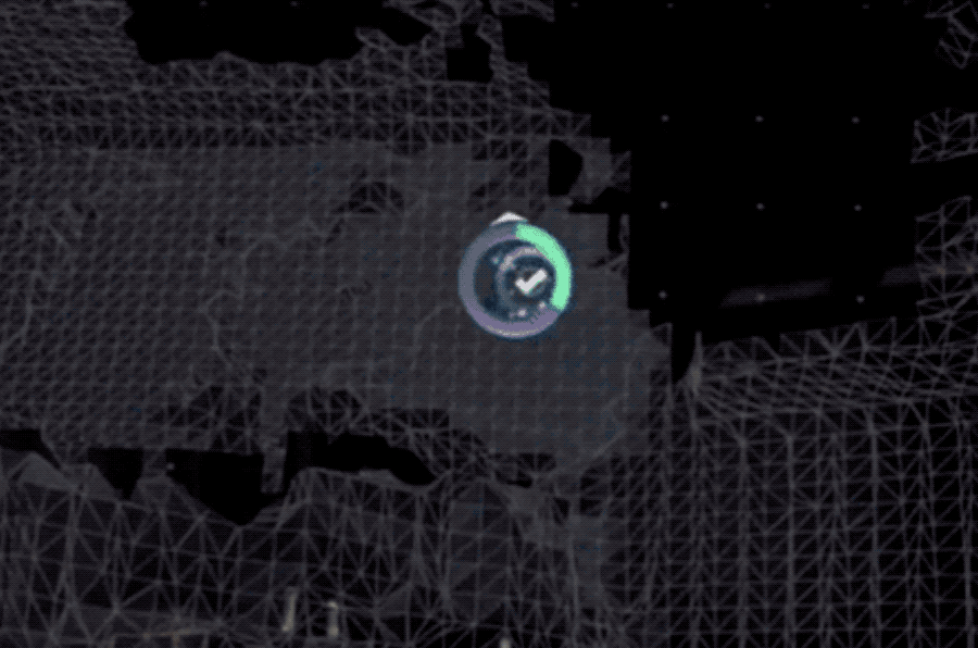
Meshing & First Time Onboarding Experience
The meshing process was crucial to the Create experience. The physics-based nature relied heavily on the user giving the world cameras enough information to understand the space and map it properly.
Highlights:
- Box based system around the user’s position
- Waypoint UI and progress bars
- Wayfinding system focusing on FOV
- Contextual tooltips on the controller
Contact
hello@lastlauf.com
Find Me Here
© 2025 Mike Laufbahn
All rights reserved
